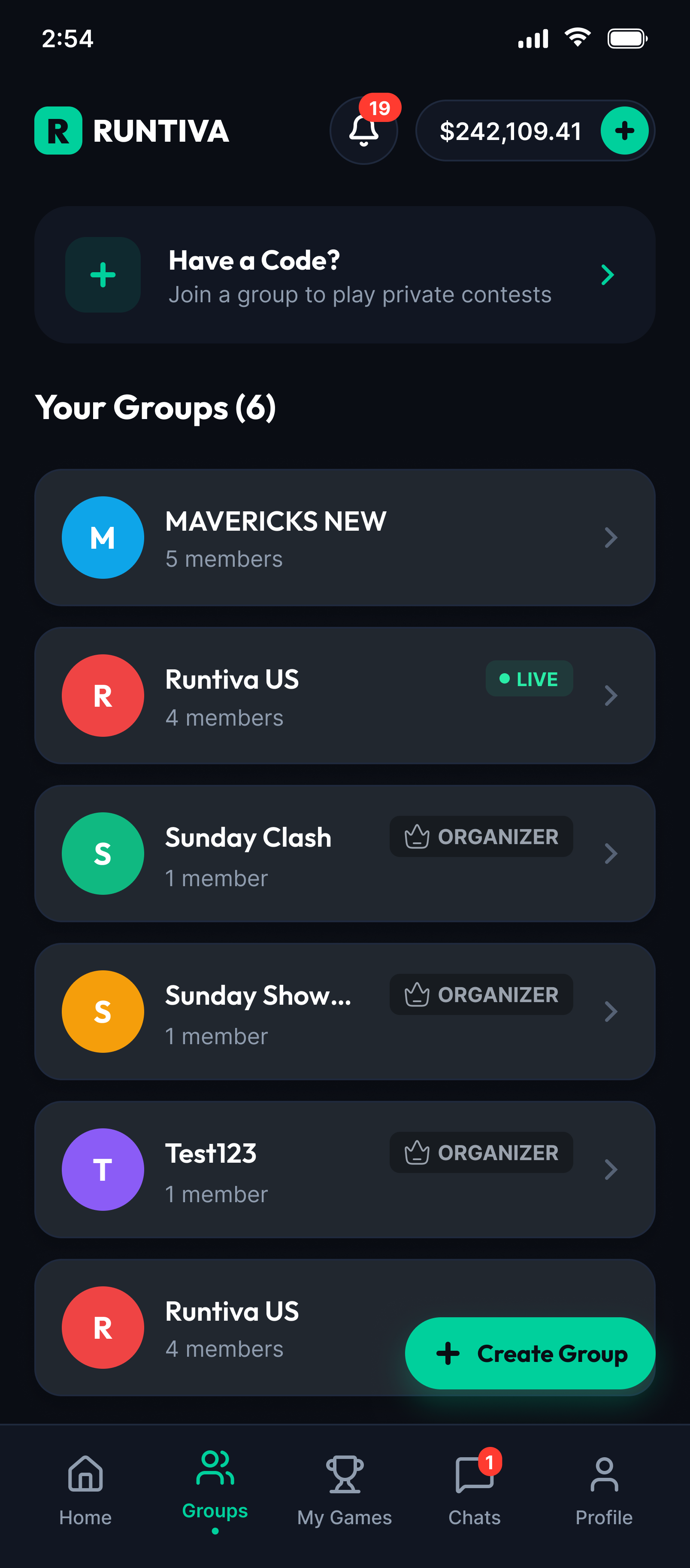
Building a multi-format fantasy sports platform from 0 to 1. The goal was one app where classic, private-group and survival contests feel like
modes of the same product, not separate products bolted together.
Role
Product Designer
Stage
0→1
Market
US fantasy sports
Platform
iOS & Android
The question
How might we create a unified fantasy sports experience that supports different contest formats, without making the product complicated?
UX architecture
User flows
Wireframes
Interaction design
UI
Design system
Prototyping
Dev handoff
01
There was a product idea, but not yet a product experience
When I joined, Runtiva was at an early stage. There was no established product experience, design system or mature UX architecture to build on.
What we had
A defined business and product direction
A target market: US fantasy sports
Product requirements
An understanding of the category
Established competitors to learn from
What we didn't have
An information architecture
Mature user flows
A design system
Established interaction patterns
Any product behaviour data
A proven navigation model
My responsibility
Product requirements
UX architecture
User flows
Wireframes
Interaction design
UI
Design system
Prototyping
Developer handoff
Iteration
02
We weren't designing in a vacuum
Fantasy sports already has strong players in the US. I studied them to understand how users discover contests, read formats and rules, build teams and track results. The aim wasn't to copy their interfaces.
114features audited
14feature categories, from discovery to withdrawals
6US apps compared side by side
1competitor (Splash) runs paid DFS, private and survivor together
Competitor matrix
App
Daily fantasy formats
Private contests
Survivor pools
In-app chat
DraftKings
Salary cap, snake, best ball; Pick6 in a separate app
Yes friends contests
Partly Sportsbook app only (21+)
Not found
FanDuel
Salary cap, single game, daily snake
Yes Friends Mode
Not found
Not found
PrizePicks
Pick'em (Player Picks)
Not found
Not found
Not found
Underdog
Pick'em, daily drafts, best ball
Partly private best ball
Partly elimination best ball
Not found
Sleeper
Player Picks (more/less)
Yes free leagues
Partly free only
Yes almost every screen
Splash Sports
Quick Picks, Tiers, One & Done, salary cap
Yes commissioner-led
Yes paid, private & public
Yes in private contests
"Not found" means no evidence in store listings or press coverage, not confirmed absence. Researched October 2026.
Where the gaps are
Paid pools with built-in social
Chat only exists at Sleeper (free pools) and inside Splash private contests. Everyone else leaves the social layer out.
Private contests as groups
DraftKings and FanDuel treat private contests as an invite-only lobby filter, not a group with members, history and an organiser.
One app for every format
DraftKings splits DFS, Pick6, Predictions and survivor across separate apps. One account and one entry flow is an open space.
Survivor in the fantasy app
DraftKings' paid survivor lives in its Sportsbook app, limited to 21+ and betting states.
Trusted pot handling
Only Splash and Sleeper hold private-pool money. Commissioners need in-app collection and payouts.
Fantasy-first positioning
Every competitor now bolts prediction markets into or beside fantasy. A calm, skill-and-friends product stands apart.
Why social matters
Fantasy players are already social offline: 84% hold a draft party (FSGA). Sleeper reports that over 90% of its growth came from friends inviting friends, and that users spend about 50 minutes a day in season with chat a swipe away. These figures are company-reported and show direction, not audited results.
03
Multiple formats. One product.
Each format brings its own rules, team structures, scoring, durations and entry requirements. Users still shouldn't feel like they're entering a different product every time they switch formats.
Different contest experiences should feel like different modes of the same product, not completely different products.
RuntivaNFL · NBA · MLB · NHL · Cricket
ClassicSingle game & multi-game · salary cap · public lobby
Private groupsInvite code · organiser · group leaderboard · chat
Before designing screens, I needed to understand the system
Users could have several contests, several teams, different formats, upcoming games and a history. The structure had to scale as more formats and features arrived.
Home
Sport tabs: All, NFL, NBA, Cricket
Promo banners
Community: groups & survivor pools
Upcoming games by sport
→ Single game detail
Groups
Join with a code
Your groups
Organiser tools
Group contests
Create group
My Games
Upcoming
Live: scores & standings
History: results & winnings
Joined contests per game
Chat
Group conversations
Reactions
Contest moments
Profile
Wallet: deposit & withdraw
Transactions
Identity verification
Referrals
Inside a game: Single game detail → Contests / My Contests / My Teams → Contest detail (Prizes, Leaderboard, Scoring rules) → Create team → Success.
05
From discovering a contest to entering it
At each stage the user has a different decision to make: what the contest is, which format it uses, what's required, how to build a team, and what happens after they submit.
DiscoverBrowse upcoming games by sport on HomeFormat badge and entry fee + prize shown together on every card
UnderstandOpen a game, compare its contests"How to play" per format; filters by fee, type and prize
BuildPick players into position slotsSalary cap tracker pinned to the bottom
ReviewCheck the final lineup and costLock countdown always visible; edit until submit
Enter"You're in the game!" confirmationLocked team, entry ID and more contests for the same team
06
How the contest flow evolved
The contest flow went through four major versions in six weeks. Each round I walked the prototype end to end, checked it against the pain points in the journey map and the audit, and fixed what got in people's way.
The contest card, four ways
$10K$5
⚡ BoosterG
V1 · Sep 4Prize first, fee as a button. Badges are icons and letters.
$35M$49
CM 3Classic
V2 · Sep 25Bigger fee button, plus a cryptic "C · M 3" shorthand for format and entry limit.
ClassicMax 3 entriesJoined 1 of 3
$25,000
$49
V3 · Oct 5Plain-language badges, the user's own entry status, and a quieter fee.
Prize$25,000Entries1 of 3Fee$49
✎ Edit team+ Add entries
V4 · Oct 14Stat columns you can compare at a glance, with actions right on the card.
Version by version
New or changed in this version
07
Three journeys, one emotional arc
I mapped how users move through each contest type, 19 stages in total, to find where trust, anxiety and excitement peak. Choose a journey, then a stage.
08
The challenge wasn't adding information. It was making it understandable.
Player selection is the densest screen in the app: positions, stats, salary, ownership, injuries and rules, all under a deadline. I decided what users need at each moment, and pushed everything else back.
IND vs AUS⏱ 2h 14m
WK 1BAT 3AR 2BOWL 3
⌕ Search players Salary ▾FFPG ▾
Player nameWK · IND · Own 42%
$9.2k+
Player name INJBAT · AUS · Own 18%
$7.8k+
Player nameAR · IND · Own 31%
$8.4k+
Player nameBOWL · AUS · Own 9%
$6.1k+
Salary left$50,000
Slots0 / 11
Fill 9 more slots
Lock time, always visible. The deadline sits in the header, so users never lose track of time while they're deep in the list.
Position slots as tabs. Labels explain unfamiliar roles such as Cricket's WK, BAT, AR and BOWL in context.
Decision data inline. Salary, FFPG and ownership % sit on each row, and injury flags appear right where the pick happens.
Cap tracker pinned to the bottom. Remaining salary and filled slots update live, so users don't have to do salary-cap maths in their head.
The CTA explains itself. "Fill 9 more slots" stays disabled until the roster is valid, and says what's missing.
—
A key decision: what stays the same, what adapts
For every format I decided which patterns stay shared across the product and which behaviours adapt to that format.
Shared across every format
Navigation and bottom tabs
Contest discovery and contest cards
Contest information layout
Team management
Player-selection patterns
Confirmation and feedback states
Adapts to the format
PrivateGroup leaderboard tab, member avatars on the card, custom rules shown as a diff from standard
SurvivalEntry covers the full season, survival bar against the elimination line, "players remaining" counter
Survival"Safe pick vs upside pick" labels based on FFPG consistency
ClassicSingle-game vs multi-game badges, salary cap and multi-entry limits
09
Designing for scale, not just the first release
Because Runtiva started from scratch, I could build reusable foundations instead of designing every screen on its own. The system had to absorb new formats without breaking consistency.
Classic Format badgeG GuaranteedM Multi-entry Fill progress
10
A product doesn't only live on the happy path
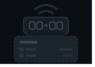
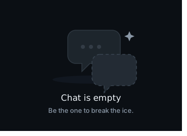
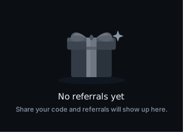
I designed for what users see off the ideal path: empty, loading, error, validation, no results, unavailable contests, incomplete teams, deadlines, unavailable players and network states. Here are some of the empty states I illustrated.
My Games: no contests yetLive: no match in progressMy Teams: no team createdChat: break the iceReferrals: none yet
Empty
Loading
Error
Validation
Success
No results
Contest full / unavailable
Incomplete team
Lock deadline
Player unavailable
Insufficient balance
Network
—
Good UX has to survive implementation
The design kept evolving as I worked with engineering. Where an interaction had technical implications, I worked with the engineers to validate feasibility, clarify behaviour, define states, resolve edge cases and simplify where needed.
11
What I contributed
Because this was a 0→1 product, the outcome was more than a redesigned interface.
Product
Translated requirements into a structured UX
Established the core user journeys
Designed for multiple contest formats
UX
Defined the information architecture
Designed the core workflows
Established interaction patterns
Covered edge cases and system states
Design system
Created reusable components
Established design foundations
Built patterns that scale across the product
Delivery
Collaborated with product and engineering
Supported implementation
Iterated on feasibility and feedback
What I learned
Architecture comes before polish. A beautiful screen can't make up for a confusing product structure.
Consistency doesn't mean identical. A scalable product needs shared patterns that still allow context-specific behaviour.
Design continues after handoff. Some of the most important decisions happen while working out with engineering what's feasible to build.