They save a possibility
"This might be useful someday." The future use is vague, so there's no obvious place to file it.
Team project · 14 days, Oct 2026 · Research → clickable prototype
Save from any app. Organize only if you want to. Find it without remembering where. A concept app for people who save things across Instagram, Pinterest, WhatsApp and their gallery, and can't find them when they need them.
01
Weeks ago, you saw the perfect onboarding screen while scrolling. You saved it, maybe. Now you need it.
You're scrolling on a Sunday. A great screen appears. Save. Keep scrolling.
Work gets busy. You forget what you saved, and why.
Monday, new project. "I saved something exactly like this…" But where?
Fifteen minutes across six apps later, you give up and start from scratch.
Four of the five people we interviewed told us a version of this story.
People who save things to use later can't find them when they need them, because their saves are spread across many apps and organizing them is a chore they abandon. How might we make saving effortless, organizing optional and finding possible from whatever people remember?
We started from a familiar designer habit: screenshotting UI for inspiration, then scrolling through hundreds of images or searching online again when the reference is needed. It's a small, everyday frustration that quietly breaks design flow.
Our first guide only asked designers about screenshots. We broadened it to anything people keep for later (recipes, places, design references, things to buy, money tips) so we wouldn't assume the problem was specific to designers.
02
Five semi-structured interviews run by team members, including a live task: "Find something you saved, right now, while I watch." We synthesised them into ten pain points, each with an evidence count. Participants are anonymised.
| ID | Profile | What they mostly save | Where they save |
|---|---|---|---|
| P1 | Instructional designer, 24 | Finance tips, products, quotes, news | Screenshots (2,162 of them), WhatsApp, Pinterest, Keep, browser tabs |
| P2 | Creative / social content user | Travel reels, poetry, audio (~20 reels a day) | Instagram, screenshots, gallery, WhatsApp |
| P3 | Fashion buyer, 27 | Photography, pottery, drawing, DIY | Instagram, Pinterest, YouTube, screenshots |
| P4 | UX designer | UI inspiration, recipes, useful posts | Instagram, WhatsApp, screenshots, Notion, Sheets |
| P5 | UX & graphic designer | Design reels and inspiration | Instagram, Pinterest, screenshots, WhatsApp |
"This might be useful someday." The future use is vague, so there's no obvious place to file it.
"There was a pottery technique…", but not "Instagram or Pinterest?"
If I can't recall the app, there's no help.P5
Every participant found saving easy. Every one of them struggled to get a save back.
It was not easy, like finding needles in a haystack.P2
P3 searches for 10–15 minutes, then often no longer feels like doing the hobby.
Forget it, I'll make something else.P3
Notion hit its limit. Instagram collections go unused.
If I like something, I can just save it and continue scrolling.P3
Posts and accounts get removed. A save can vanish without warning. Screenshots and WhatsApp self-chats feel safer, so people save twice.
We tore down mymind, Pinterest and Google Photos for patterns worth adopting (visual memory, suggested boards, time-based browsing), alongside the tools participants already use as workarounds.
| Tool | Strength | Gap we saw |
|---|---|---|
| In-app Save (Instagram, Pinterest) | One tap | Locked in one app; search barely works |
| Screenshots / gallery | Fastest habit | No context, no link back, lost in thousands of photos |
| Notion / Keep | Flexible | Needs manual filing; people stop |
| mymind | Good visual memory and smart search | Paid subscription; you still have to go looking when you need something |
Match the fastest habit, one tap, and add the one thing those tools don't offer: bringing saves back when they're useful.
03
People who save content to act on later. In our sample they were mostly designers, so we designed first for work-driven creatives (P4, P5), and checked every decision against the hobby planners too.
Composite persona from P4 and P5
Secondary: life & hobby planners (P1, P3), whose pain is emotional, losing the motivation to do the hobby, and social scrollers (P2), who save so much that only effortless capture works.
04
Smarter folders, tags and a "why did you save this?" prompt on every save.
Every option adds a decision at the exact moment people least want one. Our participants already had folders, and dropped them.
Daily digests and "you saved this a month ago" nudges.
The goal isn't to make people revisit everything. It's to have the right save ready when a task comes up.
People remember the content, not the container. So don't ask them to remember where. Let them describe what they remember, and keep saving exactly as fast as it is today.
We grouped the ten pain points into three pillars and ranked them by frequency and severity. Retrieval hurts most, but saving had to be fixed first: if Pixel isn't the quickest way to save, nothing lands in it to find.
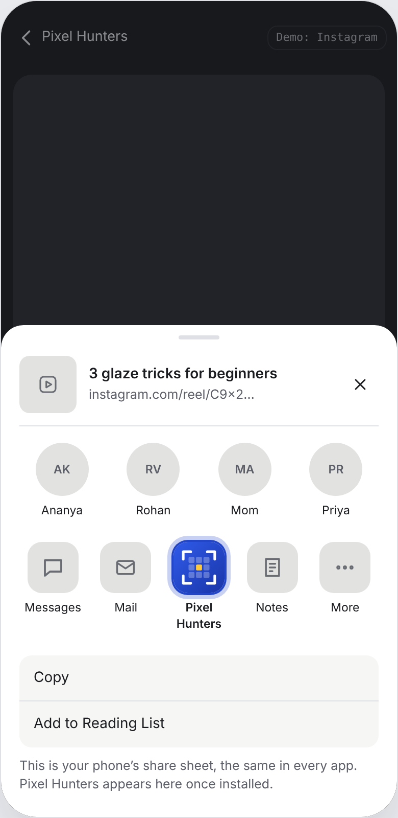
One tap from any app's Share button, and no tap at all for screenshots.
Pillar 2Optional organizingIt never blocks a save, asks one question and can be done later.
Pillar 3Retrieval built on memorySearch the way you remember it, plus saves that come back at the right moment.
Google Photos. Nobody files photos into folders. It sorts them by what, where and when, and brings old ones back as Memories. We wanted the same for saves.
We won't replace Instagram, Pinterest or WhatsApp. People keep saving where they already do, and Pixel makes those saves findable.
05
One tap, zero decisions. Pixel names each save and reads what's in it.
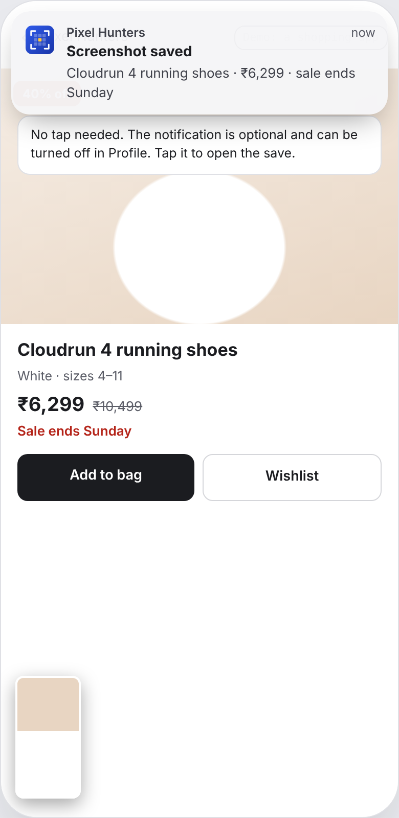
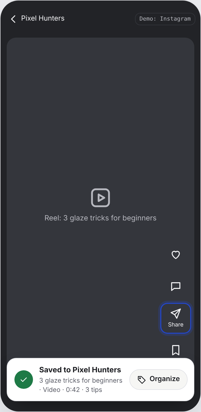
The Saved card shows content, not just a tick. A plain "Saved" makes people wonder whether it worked and what Pixel understood. Showing the title and key facts builds trust without opening the app.
Organizing never blocks a save. Every save stays in All, filed or not. When you do organize, the app asks one question: which collection?
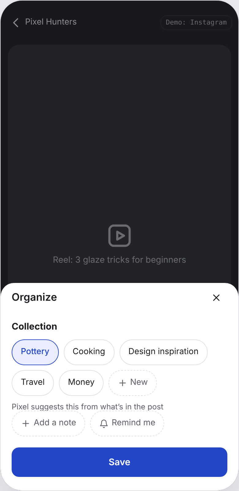
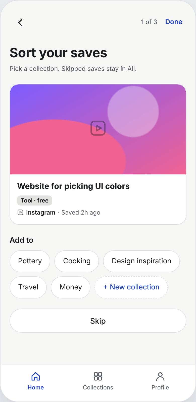
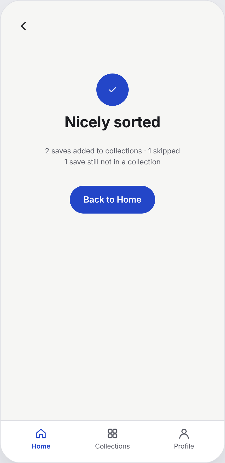
A save stays in All after it's filed. We debated moving saves into collections, the way folders work, and rejected it: people remember the thing, not where they filed it, so a save that disappears from All is a save that gets lost again.
Search the way you remember it. Never ask which app first. Bring saves back when they're useful.
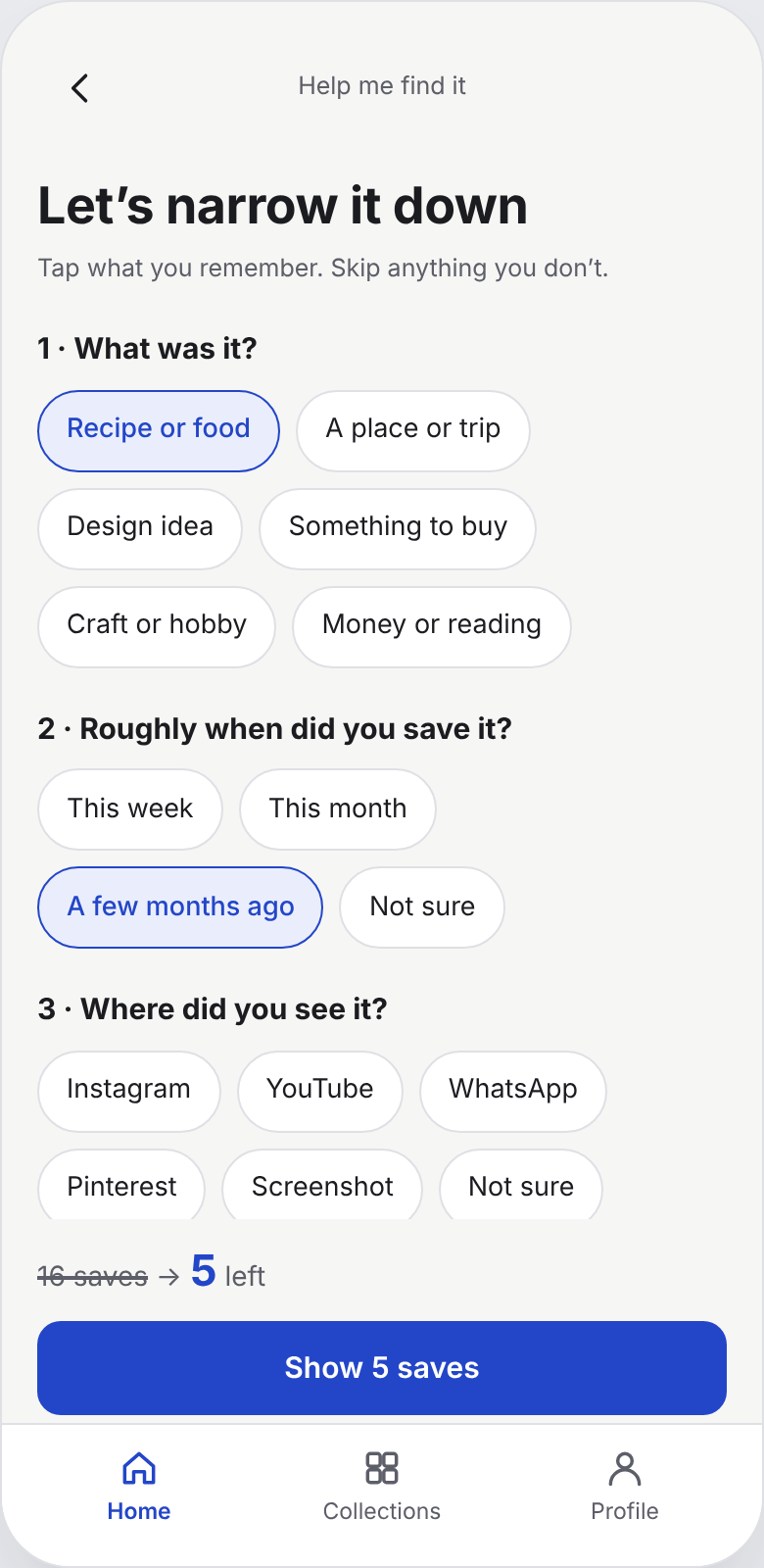
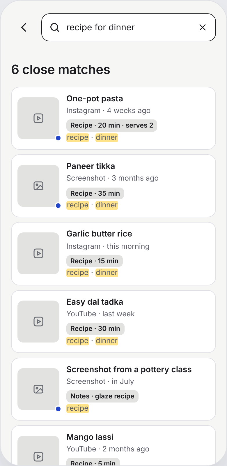
Search lives on Home, not on its own screen. In an early version, search was a separate tab with filters. People came to Pixel to find something, so making them navigate first added a step. Search now sits pinned at the top of Home, and filters belong to browsing.
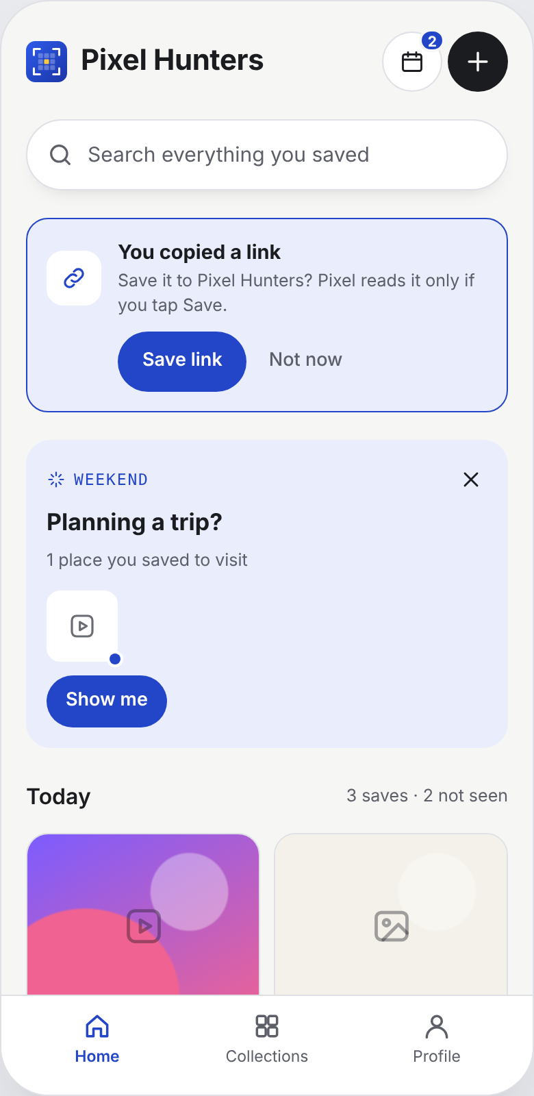
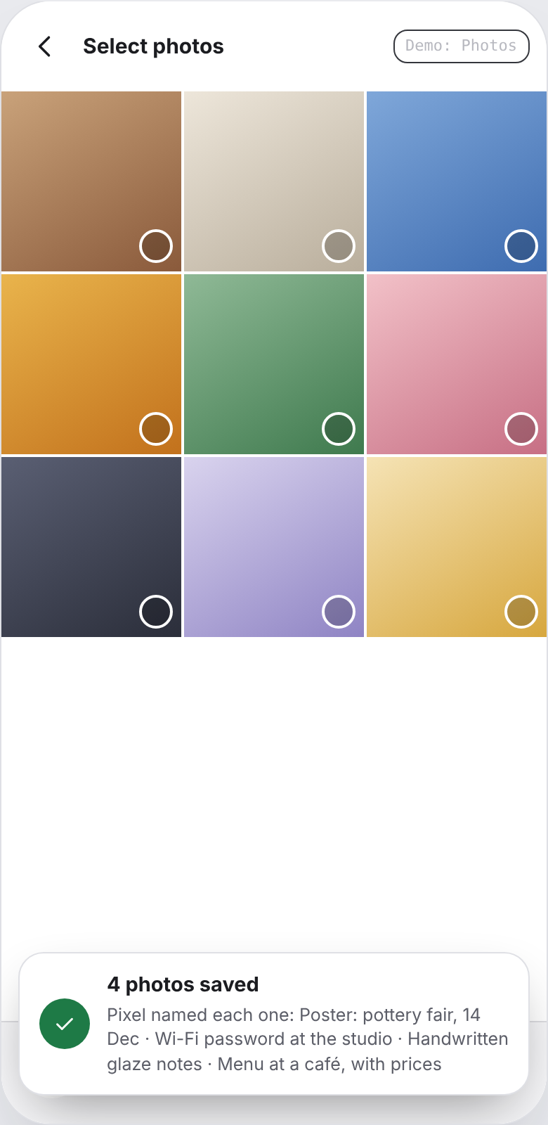
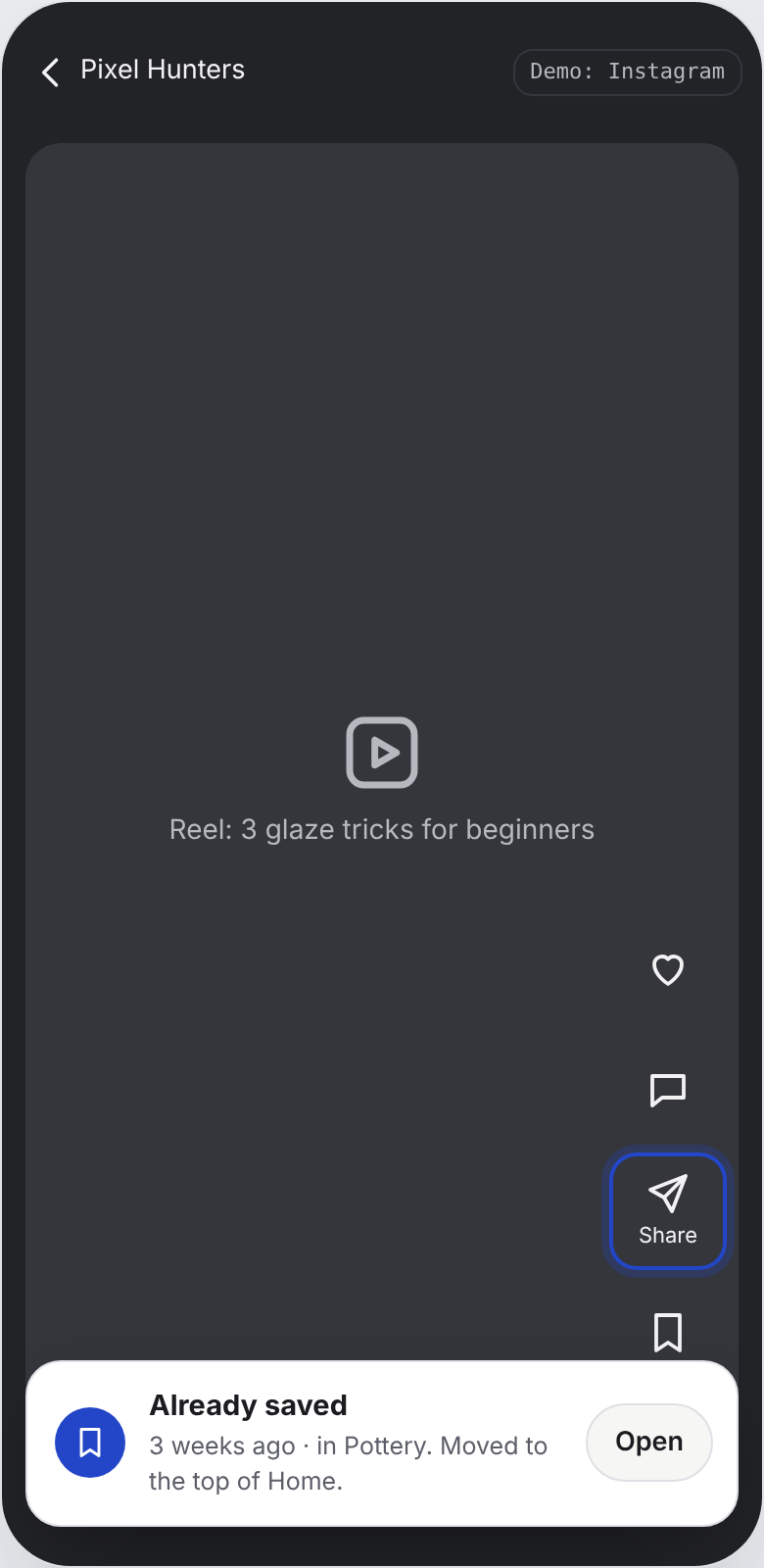
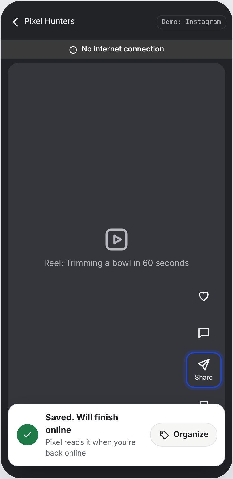
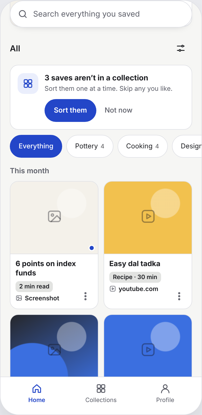
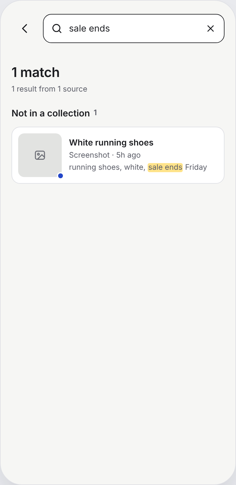
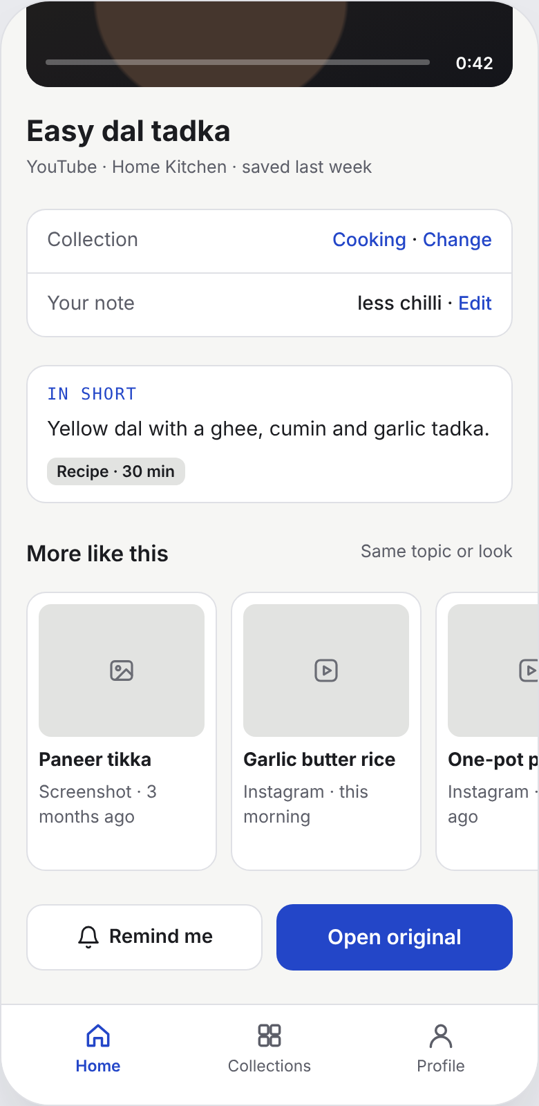
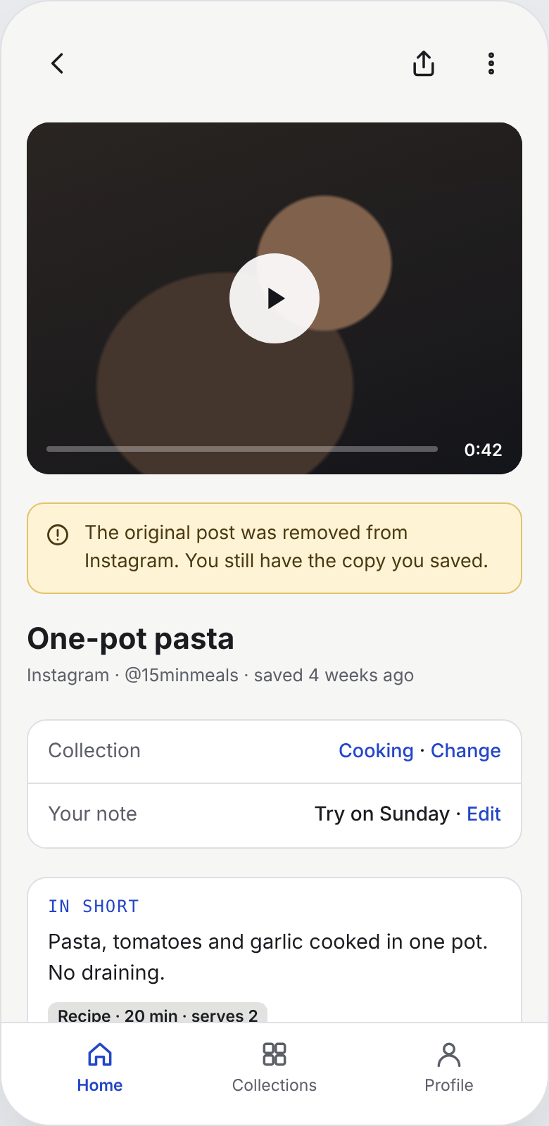
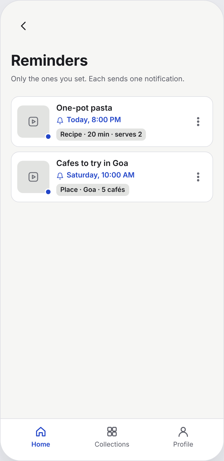
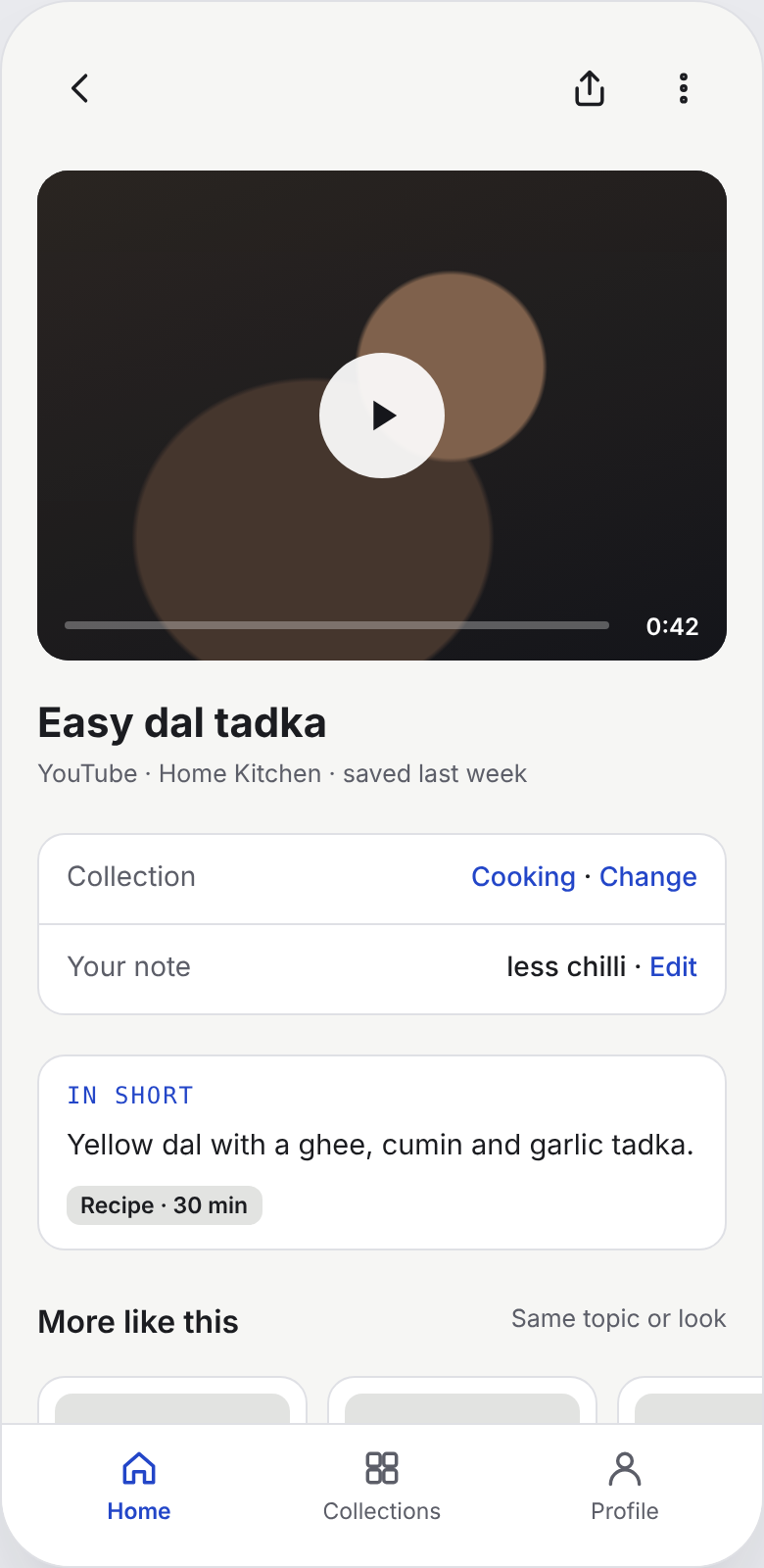
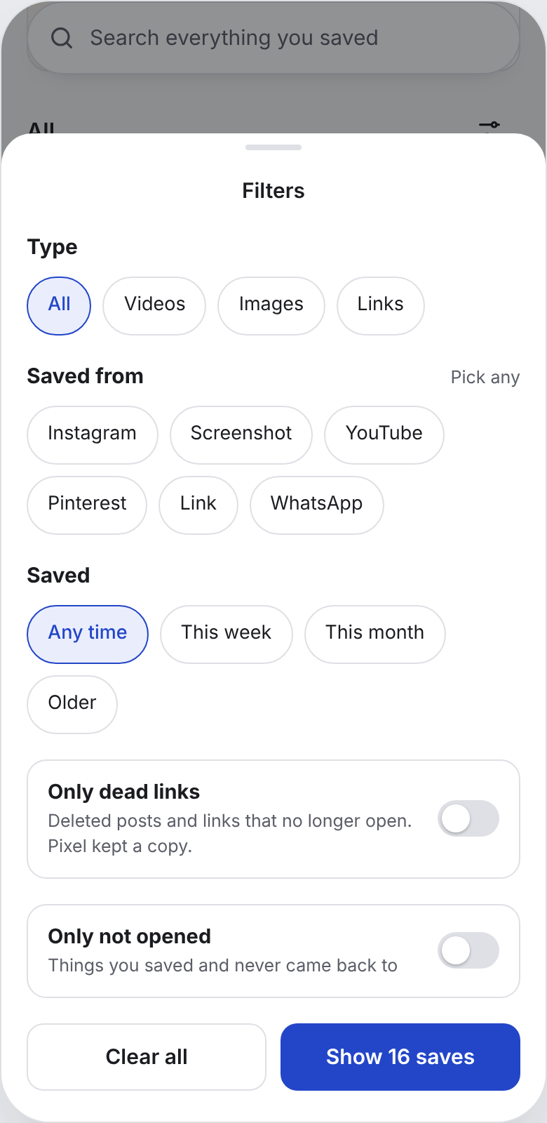
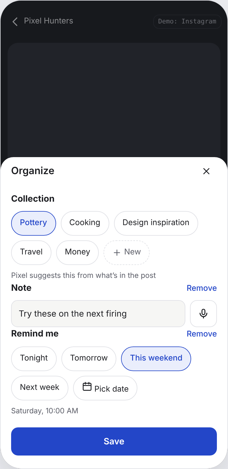
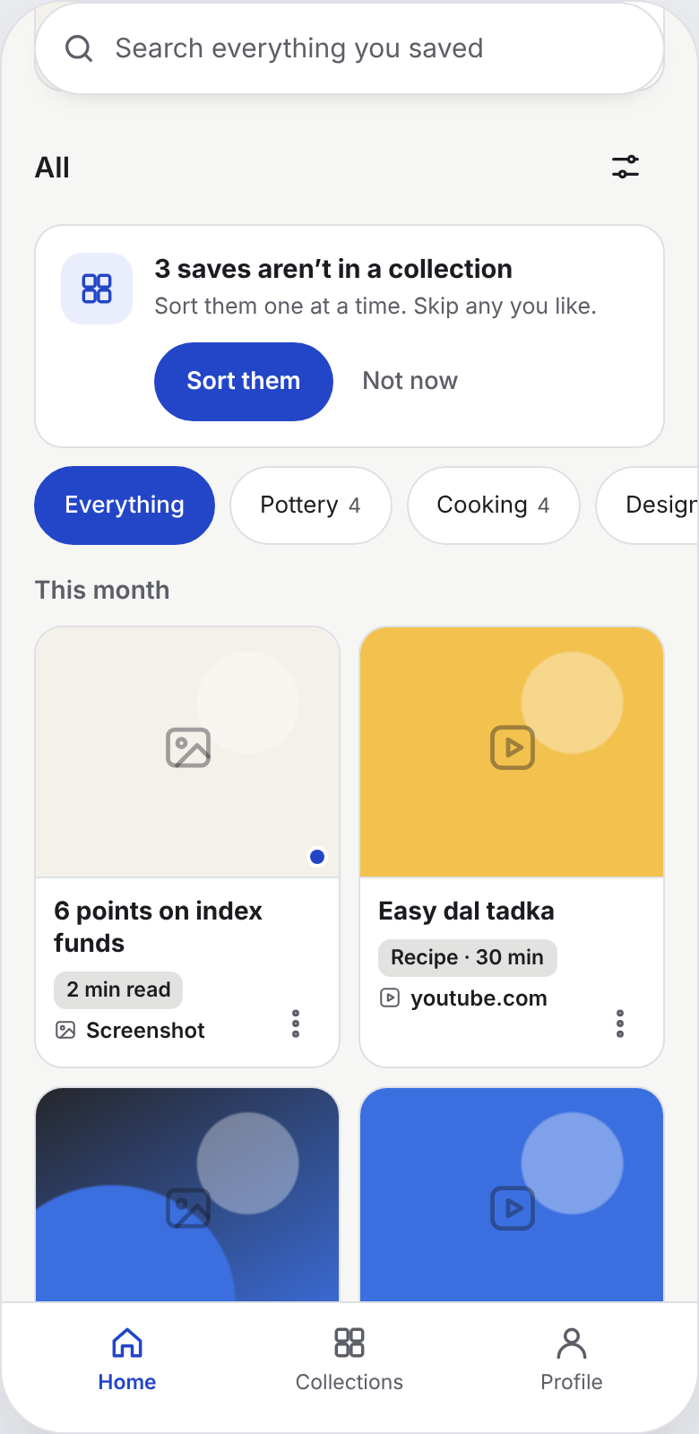
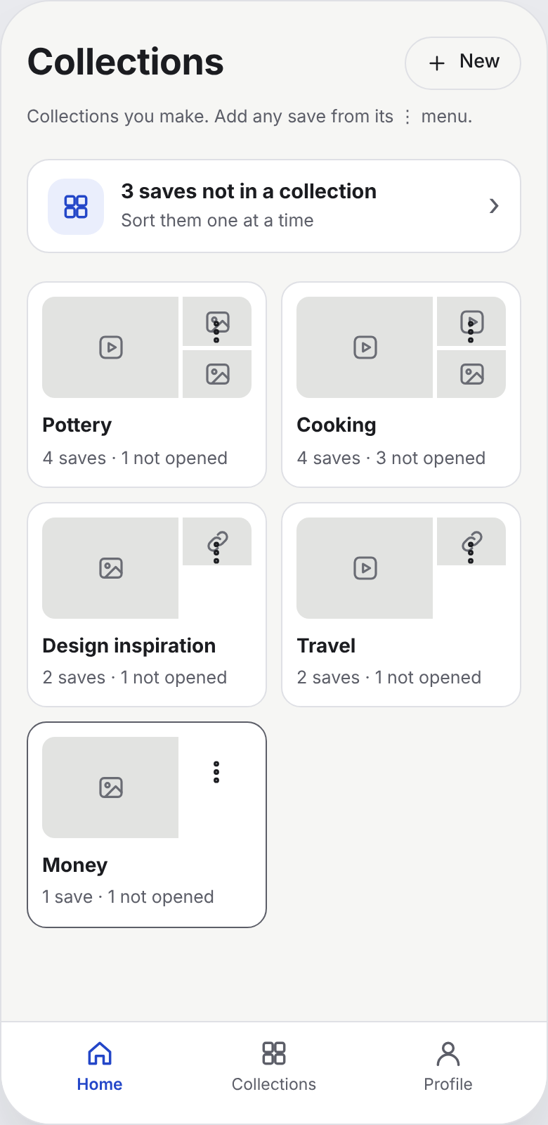
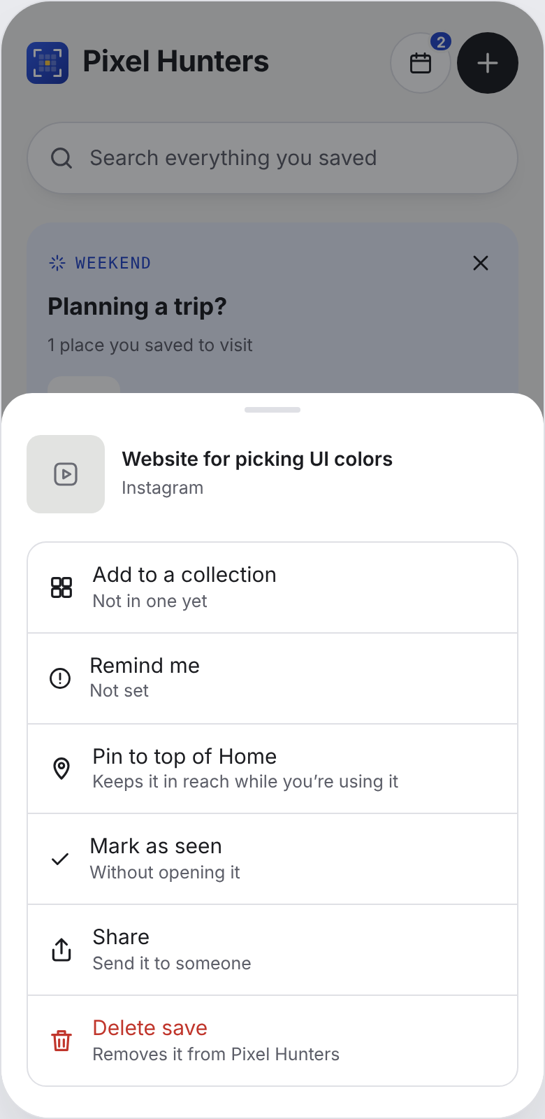
Scroll sideways for more screens.
| # | Pain point (evidence) | Pillar | What we designed |
|---|---|---|---|
| 1 | Finding is hard (5/5) | Retrieval | One search; loose matching; highlighted close matches |
| 2 | Saves scattered across apps (5/5) | Saving | Share from any app; screenshots, links and uploads in one place |
| 3 | Only look when a task comes up (5/5) | Retrieval | Moments; reminders; pin to top |
| 4 | Screenshots as a quick save (4/5) | Saving | Automatic screenshot saving; searchable text |
| 5 | Links sent to self on WhatsApp (4/5) | Saving | WhatsApp → Share; copied-link prompt |
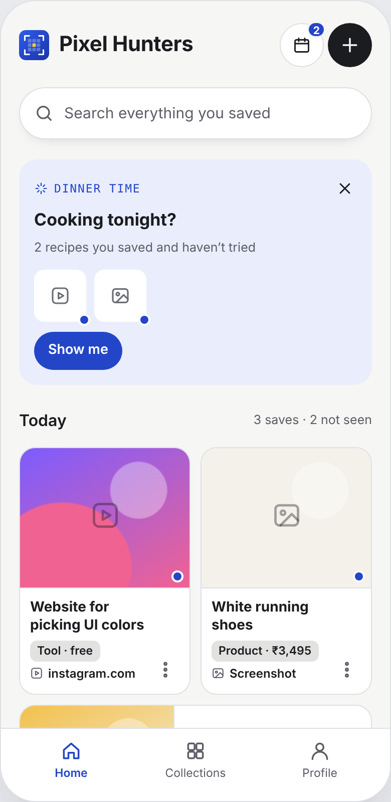
| 6 | Saves never opened again (4/5) | Retrieval | Unseen dot; "not seen" count; Not opened filter |
| 7 | They give up (4/5) | Retrieval | Help me find it on every empty search |
| 8 | Have to remember the app (3/5) | Retrieval | Search never asks for the app; source on every card |
| 9 | Organizing not kept up (3/5) | Organizing | Optional; one question; sort later |
| 10 | Saves went missing (2/5) | Saving | Private snapshot; deleted posts labelled; no duplicates |
06
We built an end-to-end clickable prototype and went through rounds of mentor and self-critique. The strongest decisions were cuts.
Five screens, each tied to a finding from the interviews.
The first save sheet asked why you're saving it (six chips), for a note, and which collection, all before "Done". Each field was optional, but together they put a handful of decisions between the user and getting back to scrolling.
The way back: saving became a small "Saved" card with one optional Organize button. Organize asks a single question, which collection, and Pixel suggests one. Notes and reminders stay hidden until you ask for them.
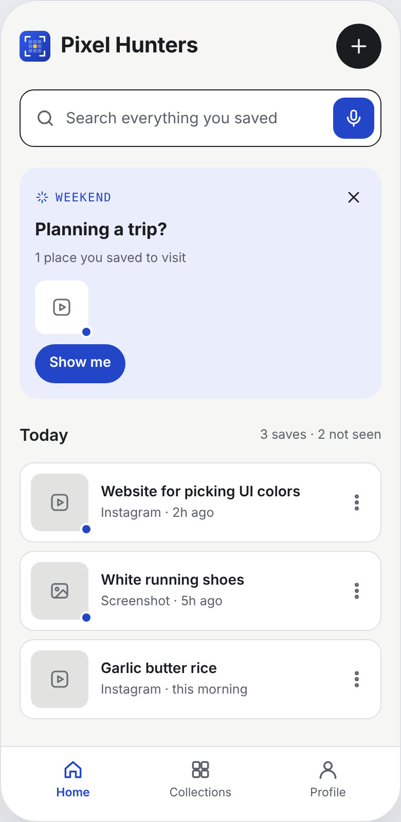
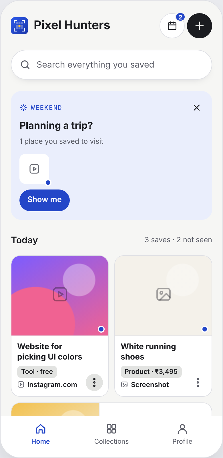
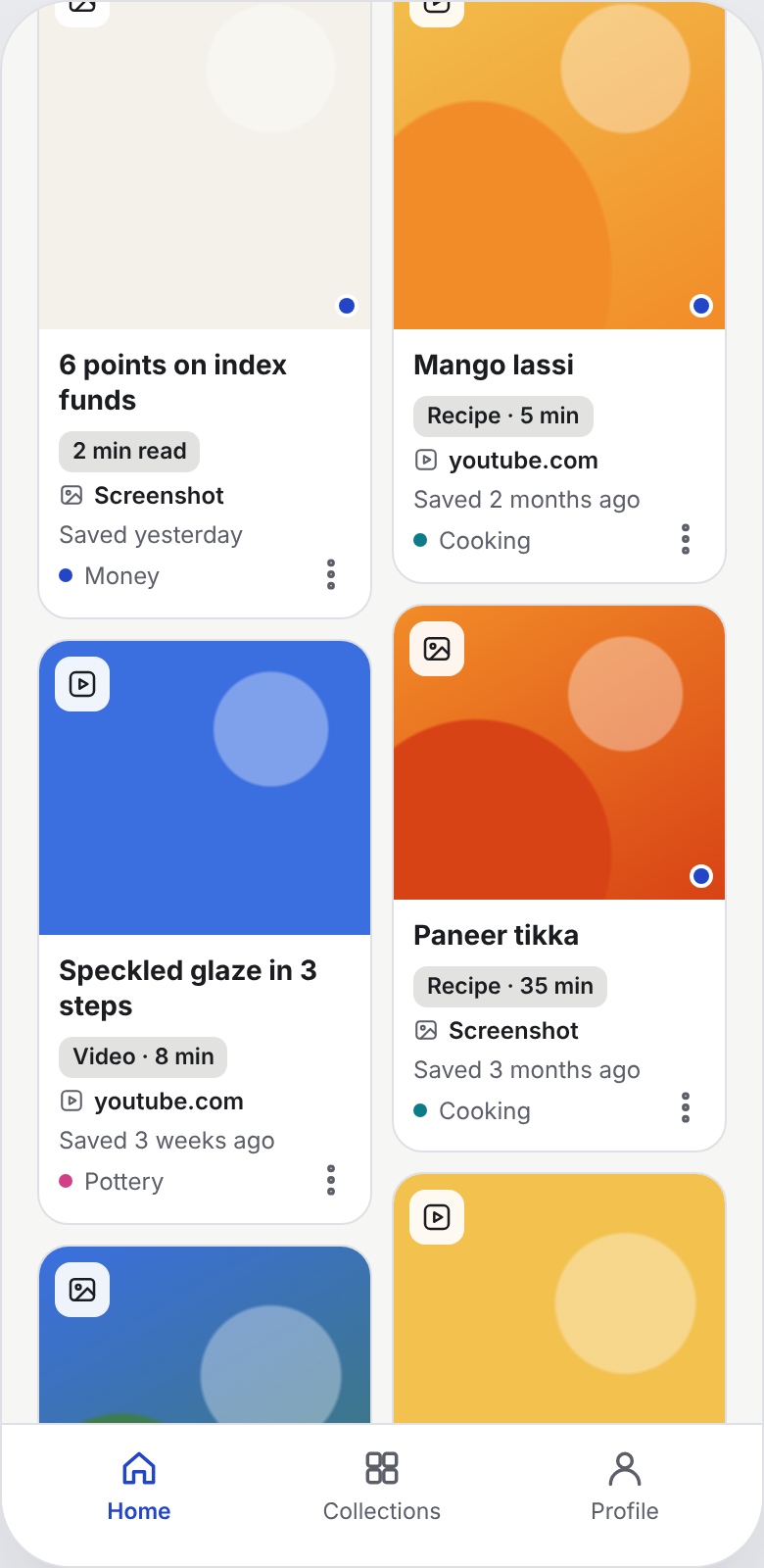
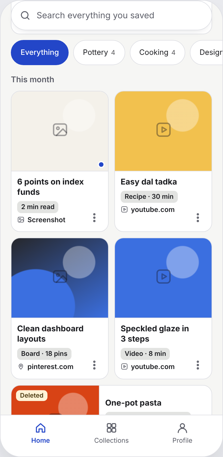
| Cut | Why |
|---|---|
| Tags | A second filing system nobody maintains. Collections and search cover it. |
| Smart collections | Confusing next to collections people make themselves |
| Separate search screen with filters | One more step before finding. Search moved to Home. |
| "Best match" vs "Also close" | People scan one list. A single "N close matches" count is enough. |
| Progress bar while saving | Saving should feel instant |
| "Mark as done" | Saves aren't tasks. It added guilt, not value. |
| Long onboarding | Name, apps, import, how-to: get people to their first save faster |
Pick an entry point on the left (an Instagram reel, a WhatsApp link, a Dribbble shot), then search for it, or try "Help me find it".
Open the prototype full screen ↗ · Nothing you do in it is stored. Smart search and Moments run on sample data.
07
A concept is only as credible as its constraints. These are the ones we know about.
| Area | Reality | How the design handles it |
|---|---|---|
| Sharing from apps | Instagram and most apps share a link, not the file | Pixel stores the link, preview image, caption and text it can read. It doesn't download other people's videos. |
| "Keeping a copy" | Re-hosting someone else's content raises copyright and platform-terms issues | Keep a private snapshot for the user (thumbnail, caption, extracted text), never shared. Needs legal review before build. |
| Reading images | On-device text and image recognition exists on both platforms (Apple Vision, Google ML Kit) | Process on the device where possible, which is also better for privacy |
| Auto screenshot saving | Needs photo access. On iPhone, new screenshots are picked up when the app runs or refreshes in the background, not instantly. | Opt-in during onboarding, and the notification says "saved" rather than promising it's instant |
| Clipboard | Reading the clipboard triggers a paste permission prompt on iPhone | Detect that it's a link without reading it, and read it only when the user taps Save |
| Smart search quality | The prototype runs on sample data | Validate with real saves (see the validation plan) |
08
Not yet tested. These are the targets we'd test against.
| Pillar | Metric | Target |
|---|---|---|
| Saving | Time from tapping Share to saved | Under 3 seconds |
| Saving | Share of saves that need no follow-up | Over 90% |
| Organizing | Found saves that were never filed (shows finding doesn't depend on organizing) | Track; expect over 50% |
| Retrieval | Finding a known save on the first search | Over 70% |
| Retrieval | Finding it within 30 seconds, with or without Help me find it | Over 85% |
| Retrieval | Saves opened again within 30 days (versus about 0 today) | Track as a baseline |
5–6 participants, at least half non-designers, with three tasks:
09
Tags, smart collections and a separate search screen all seemed helpful. Each one added a decision for the user.
Retrieval is the biggest pain, but saving had to be fixed first: if Pixel isn't the quickest way to save, there's nothing in it to find.
Recruit beyond designers from the start, and test the save flow with real people before designing the retrieval features.
Limitations: five interviews, mostly designers. Evidence counts are strong signals, not proof. Smart search and Moments are simulated on sample data.